While working on my own application, I had time to share interesting solution to the problem that occurred during developing. Especially since this element is quite common and often used. But I hope that this method can be useful to someone even for other tasks or inspire improvement, so I decided to share a detailed explanation of how the method works.
In the process of writing own app for iOS, I was need to create a custom Page Control in the form of circles showing the current position in the list of cards. I’ve created a public library based on this approach, so you are welcomed to include it into your project using SPM or CocoaPods Wave Page Control.
To begin with, I will explain the essence of the problem. The simplest version of Page Control looks like the first animation below:

The problem is that we have a width limit, and at some point the number of elements reaches such a level that the overall width of the page control will go beyond the specified limits. Since I did not find a ready solution which I liked, I drew several options and chose the ones that I think would be acceptable. Rejecting all the options with a space elements like three dots inside or conversion to a slider that the user clearly and quickly realized where the position is, allocated as follows:
- Do all items less size to meet the width limit (but current element is not well seen at the small sizes).
- Leave one element of the original size, and equally reduce all the others.
- Make a smooth transition from the original size of the element to a smaller one through the specified number of steps.
I chose option #3, because it gives the most interesting and attractive appearance, yet we can clearly see the current page that is most highlighted item. In addition, in order to achieve a harmonic transition, it was decided to make a transition through the cosine function.
The result is clearly shown in the following animation.

1. Calculate steps
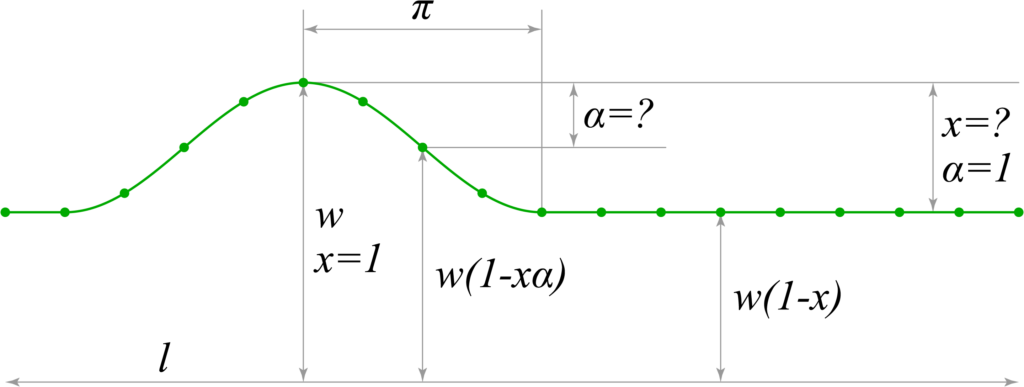
Let’s take the basic size of the element for and mark it on the graph. The ultimate goal of calculations is to find the size of the smallest element. All elements outside one cosine wave will be the same size as the smallest element at the end of the wave.
The main condition and essence of the problem is to keep the same width of the whole Page Control, ie the sum of all elements must be constant.
* For fewer elements, you can manually enter an element size limit, as applied in the animation above. Without limitation, the side elements will become larger on the contrary in the lack of elements. Also, if the width is very small, the dimensions can take negative values. In this article, I will not impose these restrictions so as not to complicate the article.
To begin, let’s build the desired graph:

Let’s design the function that will give us the appropriate graph. The following function gives a result in the range from to
, which will be useful for calculating the relative coefficient for calculating the base value of the
reduction, through which we calculate the size of the smallest element.
, where
— is the angle in radians.
Remember this formula, it will be needed below for calculations. Graph:

The next step is to enter the values needed to calculate the size of each element.
— total width of Page Control (sum of all elements)
— base size of one element
— total number of elements in the Page Control
— desired size of the smallest element
— inversely proportional coefficient of
size reduction, from
to
. For example, when
,
— is a directly proportional coefficient of reduction of the coefficient

Assume that the base size is . As the smaller size will be reduced by the
, smallest element is calculated by the formula
.To calculate the intermediate dimensions it is not enough to use
, so we introduce an additional coefficient
that will take part of
in the range from
to
. So now any size can be calculated by the formula
. According to this formula for each element only
will be changed, so the sum of all elements will be calculated as follows:
where this is the number of elements (see the last index). Therefore, to find the total width, we can derive the following final formula:
where is the arithmetic mean of all
from
to
.
Since our goal is to find the size of the element, we need to derive from this formula, which we will do. For ease of calculation and prevent errors I have used the service WolframAlpha (forgive me math school teacher).
2. Draw waves
All we have to do now is calculate all for each element and find the arithmetic mean for them. Remember our cosine function?
Move the angle rad to the left to invert it relatively to the graph with the size of the elements, and get the formula:
, where
— is the angle in radians. (or the distance from the central element).
Let’s build a graph indicating the required values:

Did you notice? Of course! The same inverted graph from a previous image in the range of yet unknown : )
Let’s remember the rule developed above, which determines the appearance of our Page Control. The value of for the last element of the transition always falls on the
radian. Therefore, for all elements outside one wave we determine
, which will give a straight line on the graph and the same size for all subsequent elements.
The half-wave on example graph is divided into 4 sections (Below in the example of the code it will be determined as 5 elements in the half-wave, the largest and least inclusive). So for the largest element calculation takes the form:
, and therefore
, ie full size.
And for the last element of the wave we will have the next calculation:
, and therefore
, ie the base amount reduced by the full
, that is the smallest element.
What’s next? Then we calculate for each element, and substitute in formula derived in the preceding paragraph.
3. Building result
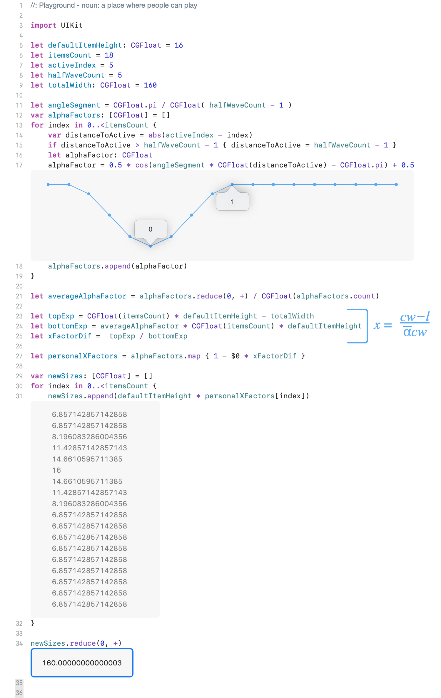
Theory is certainly interesting, but much more interesting to create something where it would be useful. So just let’s sum up all the calculations using the code. I used Swift language, but I’m sure it will not be difficult to rewrite using any language you use, the syntax is simple to understand.

Everything worked, the calculations are correct. Check in the end of the test code produce the desired width of 160 points.
Duplicating variant of the real interface element, based on the above calculations. Our page control looks much better animated and on real 60 fps;)
So what can be learned from this article? I actually strengthened in the belief that much more fun to exercise creativity and invent creative solutions at least occasionally. It does not let you get bored and gives reason to enjoy the results of your work. And who among us does not want to feel a little aesthetic pleasure. . .
